Prelude Fertility —
Brand Identity Design
CREDITS —
Studio: And Repeat
Client: Prelude Fertility
Creative Director: Martin Grasser
Senior Designer: Vina Rostomyan
Photography: Jake Chessum
Photography: Getty Images
Digital Platform: Sweden Unlimited
Prelude Fertility is a national network of clinics offering egg freezing, IVF, genetic testing, and egg donation—helping people become parents when they're ready. Their mission centers on compassionate, personalized care during one of life's most vulnerable moments.
When we began working with Prelude, their existing identity felt edgy and intimidating—misaligned with the warmth and support their patients needed. We were designing for people already carrying anxiety, and the brand needed to hold space for that.
The work began with a question: What does compassion look like? How do you create calm when someone is navigating uncertainty?
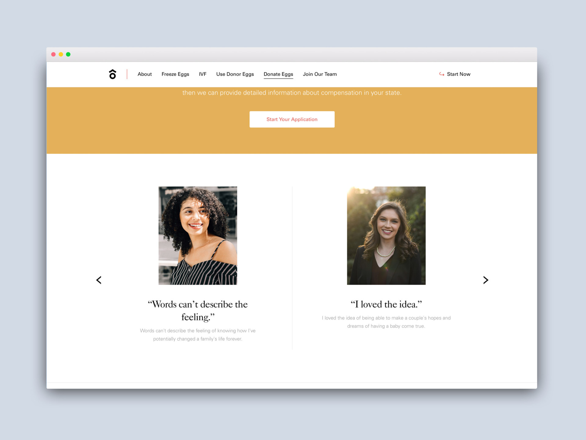
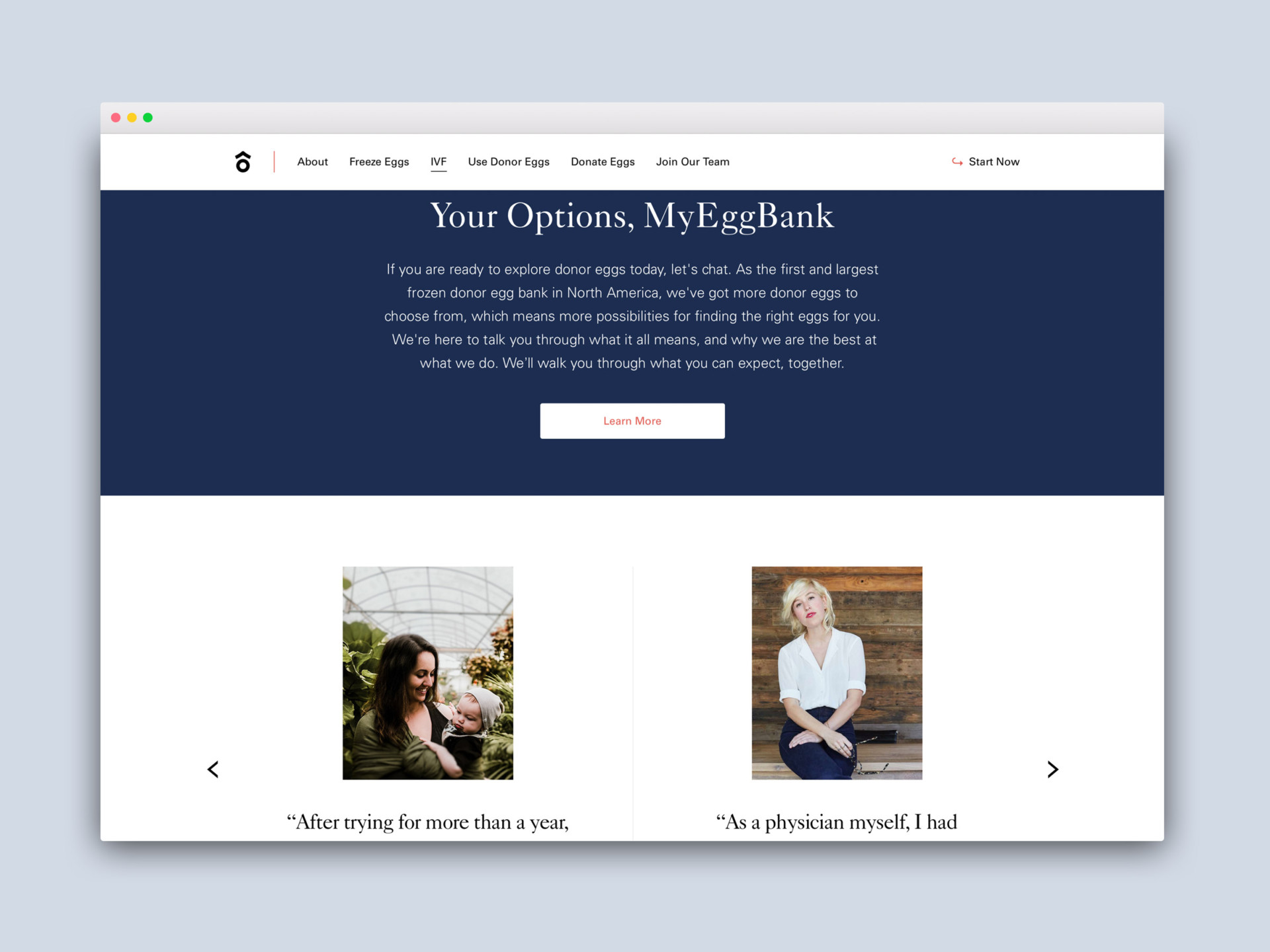
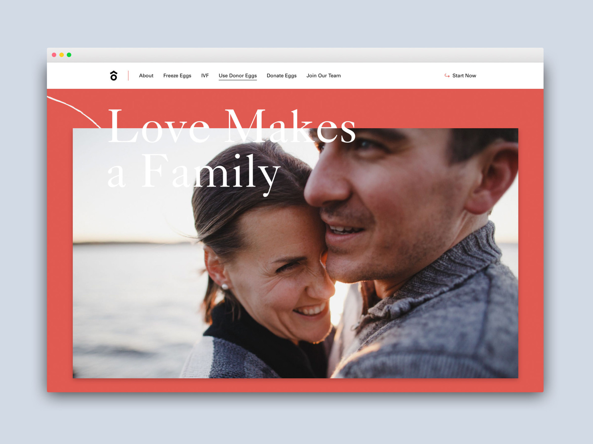
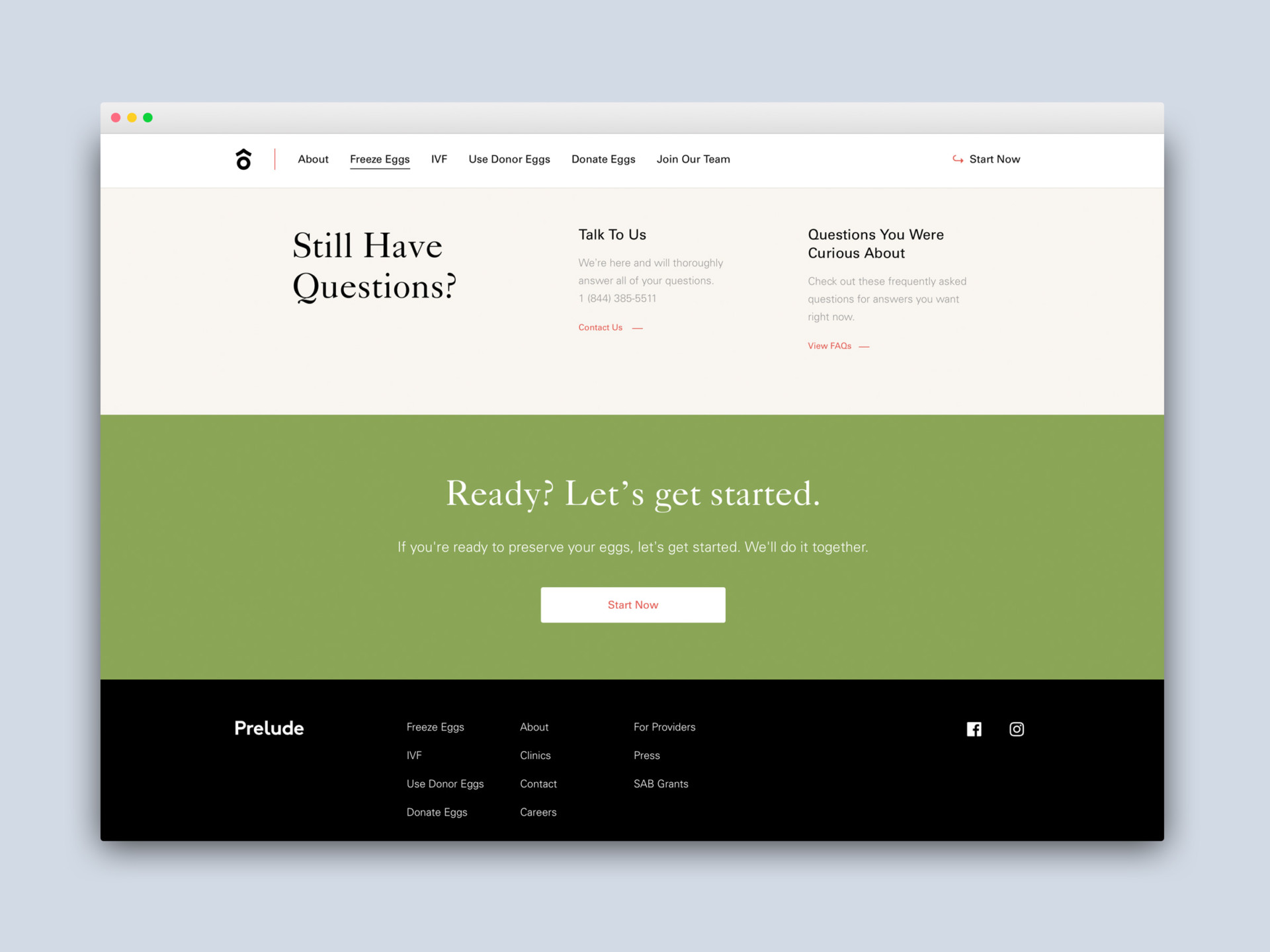
We stripped away everything unnecessary and returned to Prelude's core values. A warm, grounded color palette with neutral tones. Caslon for elegance, Univers for clarity. Hand-drawn illustrations with organic forms to bring humanity into the system. Photography lit with soft, natural light—images that felt safe, not clinical.
We partnered with Sweden Unlimited to translate this into a digital platform that made complex medical information feel approachable and clear—an extension of the care Prelude provides in person.
We partnered with Sweden Unlimited to translate this into a digital platform that made complex medical information feel approachable and clear—an extension of the care Prelude provides in person.