Microsoft Applied Sciences —
Brand Identity Design
CREDITS —
Client: Microsoft
Role: Art Direction & Graphic Design
Microsoft Applied Sciences is a research and development lab creating the next generation of human-computer interaction. The interdisciplinary team works at the intersection of optics, electronics, materials science, acoustics, and software—building interfaces that reimagine how humans and machines connect.
Applied Sciences needed a symbol flexible enough to represent their full spectrum of innovation without anchoring to any single discipline. It needed to feel both specific and expansive—grounded in their work while speaking to their broader vision.
Applied Sciences needed a symbol flexible enough to represent their full spectrum of innovation without anchoring to any single discipline. It needed to feel both specific and expansive—grounded in their work while speaking to their broader vision.
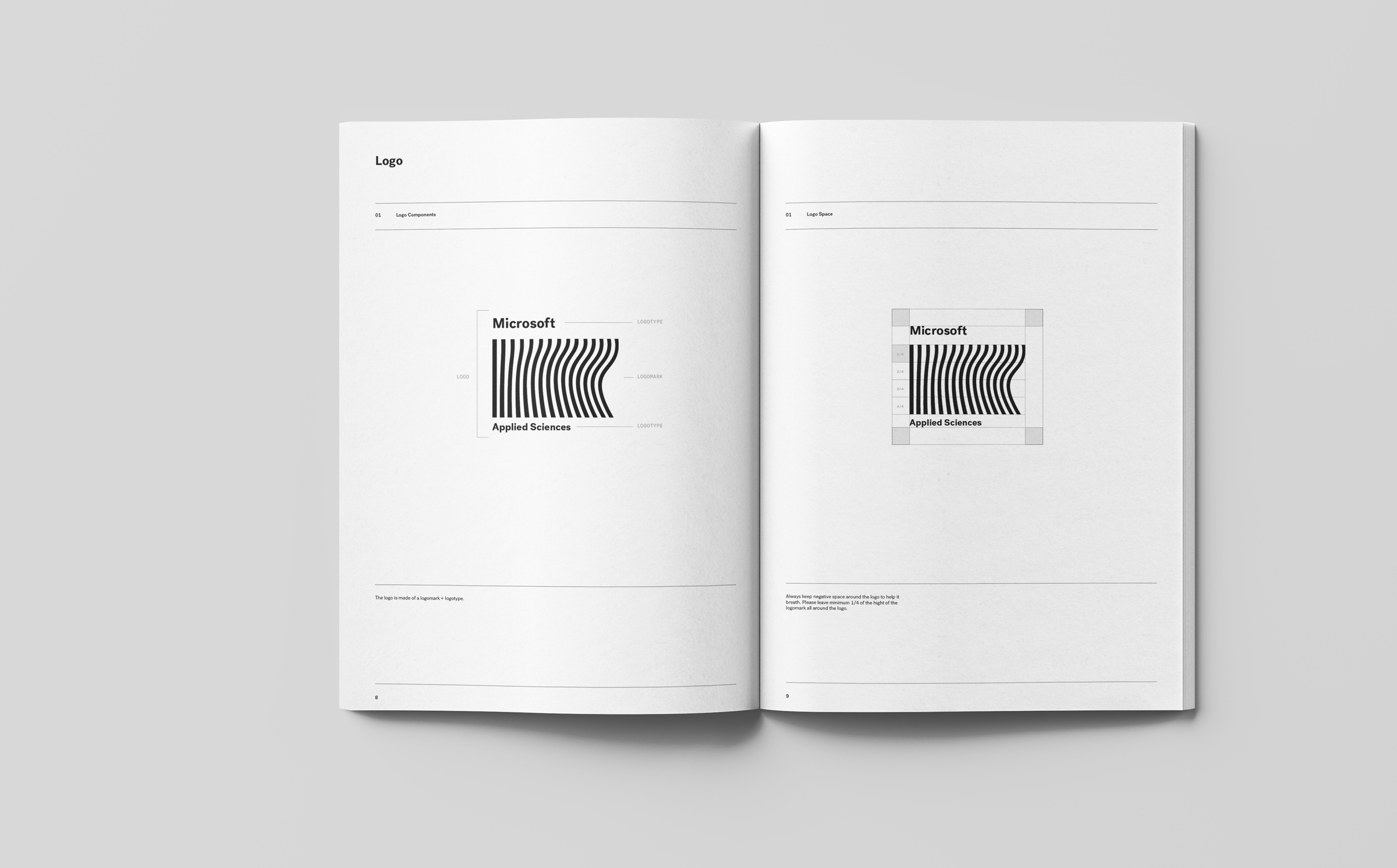
The mark is built from a single line that transitions from rigid geometry to organic flow—the synergy between mechanical and human. The number of lines mirrors the letters in Applied Sciences, creating a subtle system within the symbol itself. It reads as both barcode and wavelength, technical and alive.
The identity is designed to scale across contexts—adaptable enough to live on hardware, materials, and digital surfaces while maintaining its core meaning.
The identity is designed to scale across contexts—adaptable enough to live on hardware, materials, and digital surfaces while maintaining its core meaning.